A histogram is a summary graph showing a count of data points that fall in various ranges. Histograms are used in statistics and other forms of mathematics. In this video, learn how to create your own histogram using data analysis on the computer. This tutorial will show you h ...more
Need to know how to use your Texas Instruments graphing calculator for your college math or statistics class? You're in luck... watch this video tutorial to see how to create a histogram with a TI-83 graphing calculator. Creating a histogram from grouped data. Consider the f ...more
Need to know how to use your Texas Instruments graphing calculator for your college math or statistics class? You're in luck... watch this video tutorial to see how to create histograms with a TI-83 graphing calculator. Creating histograms from raw data. Create a histogram f ...more
From Ramanujan to calculus co-creator Gottfried Leibniz, many of the world's best and brightest mathematical minds have belonged to autodidacts. And, thanks to the Internet, it's easier than ever to follow in their footsteps. With this installment from Internet pedagogical sup ...more
From Ramanujan to calculus co-creator Gottfried Leibniz, many of the world's best and brightest mathematical minds have belonged to autodidacts. And, thanks to the Internet, it's easier than ever to follow in their footsteps (or just study for that next big test). With this in ...more
In this video the instructor shows how to create charts and graphs in Microsoft Word. First, open the Word document and select an area to insert the charts. Now go to the Insert tab in the ribbon and select the Chart icon. The Insert Chart window opens up with various chart te ...more
Need to know how to use your Texas Instruments graphing calculator for your college math or statistics class? You're in luck... watch this video tutorial to see how to create boxplots with a TI-83 graphing calculator. Creating boxplots. Create a histogram for the list of num ...more
There is a new function in MS Excel 2010 called ‘Sparkline’ which helps you quickly find trends associated with a set of data. To create Sparkline, you can go to ‘Insert’ tab and then select ‘Sparkline’ section and then select the graph type. After you enter the data range and ...more
To test how fast your internet speed is an intermediate level skill. Start by picking an internet speed test. You can use Google or another search engine to find one. A service that is recommended in the video is DSLreports. This site does not require you to know a lot of info ...more
If you use Microsoft Excel on a regular basis, odds are you work with numbers. Put those numbers to work. Statistical analysis allows you to find patterns, trends and probabilities within your data. In this MS Excel tutorial from everyone's favorite Excel guru, YouTube's Excel ...more
If you use Microsoft Excel on a regular basis, odds are you work with numbers. Put those numbers to work. Statistical analysis allows you to find patterns, trends and probabilities within your data. In this MS Excel tutorial from everyone's favorite Excel guru, YouTube's Excel ...more
You will learn to create graphs in Illustrator. The best way to visualize data is a graph, and there are several different graph choices in this program. He chooses a column graph to show how he creates his graphs. Holding the left mouse button and dragging, he creates a recta ...more
In order to format graphs and charts using Microsoft Word 2007, click on Chart Tools. The tabs at the top of the screen provides you with your options. You can change the type of chart or graph by clicking on Change Chart Type. If there is a particular type of chart that you w ...more
This morning, the Official Google Blog and Chrome Blog revealed the new tab page, which lets you flip between your installed apps and your most visited web sites. To take a look at how it works, check out the video below. The Chrome Web Store also received a facelift. It's now ...more
Ever wonder what those bars and lines on the LCD screen on your digital camera do? In this great tutorial, Ethan Wilding demonstrates how to read one of the most useful features on your camera: the histogram. The histogram is a graph which represents the distribution of light ...more
In this quick tutorial, I show you how to compare data using an in-cell bar graph in the Open Office Calc Program by using the '=REPT' formula.
In this tutorial, we learn how to make your first graph in Microsoft Excel. First, open a new graph and enter in your data. Click and drag down from the original date you enter to have the other dates automatically entered in. Enter the rest of your information, then highlight ...more
In this tutorial, we learn how to make a histogram chart in Excel. To create a vertical histogram, you will enter in data to the chart. Then, highlight all of the data and go to "insert", "chart", then choose a regular column chart. Grab a regular 2D column and then make sure ...more
Photoshop. It’s like a mountain to climb. You can chug up to the top, working hard, never letting up, or you can just go part way up and scoot around the side of the mountain and still get to the other side. Not everyone needs to be a Photoshop guru, or ninja pixel punisher. T ...more
100% functional LEGO ATM by Ronald McCrae. This bonafide brick bank performs the following functions: Bill scanner can be calibrated to accept any type of banknote Machine accepts only the type of bill for which it is calibrated Tolerances for bill acceptability are adjustabl ...more
In this Software video tutorial you will learn how to make a basic bar graph in Microsoft Excel. You will also learn how to give your chart a title and how to label the axes. First you put in all your data in to an Excel spreadsheet. Then you highlight the data you want to put ...more
How to make an instant, in-cell bar graph in a Microsoft Excel spreadsheet to make comparing data instantly visible.
Deke McClelland explains what the Levels and Histogram commands can do in Photoshop in this video tutorial. Levels allows you to adjust the luminance levels allowing you to adjust the contrast and colors within each color channel of an image. Thus, Levels allows you to adjust ...more
If you want to create a Pareto Chart for categorical data in MS Excel you should first have your data input into Excel already. From your data, you should highlight the cells that you want to count the frequency for and in the frequency box you should type in =COUNTIF and high ...more
In this software tutorial, Corey demonstrates how easy it is to create 3D graphs using Illustrator. You don't have to run to Microsoft Excel anymore to get good looking charts and graphs. OK, well you do if you need super accurate data fast, but not if you just need some 3D gr ...more
This video is an instructional guide about Graph Linear Equations presented in algebraic form. It is an easy to follow, step by step guide to solving such equations using the graph intercept formula. The first example equation is Y = 2x -1 over y = mx + b. The video then shows ...more
What is a Data Structure? When we think of a "structure" we often think of architecture, but data also often has structure. There are many different types of data structures: arrays, graphs, queues, stacks, and so on. We use these structures in order to be able to effectively ...more
In excel a left click is made on box A1 and the X title is typed in as year. In A2 the year 2001 is typed and in A3 the year 2002. Both A2 and 3 boxes are highlighted and the bottom right hand corner is used to drag the work into a copied sequence down to A12. In B1 "populatio ...more
This video demonstrates how to create a graph or chart in Excel 2007. From the people who brought you the Dummies instructional book series, brings you the same non-intimidating guides in video form. Watch this video tutorial to learn how to create a graph or chart in Excel 20 ...more
Welcome to Minecraft World! Check out our advanced tutorials and come play on our free server. While mining is a basic aspect of Minecraft, it is often overlooked. Every adventure requires iron and diamonds and other ore and if you're playing in hardcore mode then you need al ...more
In this software video tutorial you will learn how to create a column line graph in Microsoft Excel 2007. First you type in the data in to the work sheet. Then highlight the data and click 'insert' on the menu bar. Here you select the 'column' option and go down and click on t ...more
Here is how to make a histogram-like display in Excel 2008 for OSX. Note that you have to right click on the actual bars in the graph to get the menu to come up. If you work on a Mac and need to use Excel 2008 to make histograms, then watch this MS Office tutorial.
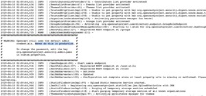
When it comes to sniffing Wi-Fi, Wireshark is cross-platform and capable of capturing vast amounts of data. Making sense of that data is another task entirely. That's where Jupyter Notebook comes in. It can help analyze Wi-Fi packets and determine which networks a particular p ...more
Data is king. Nearly every carrier and MVNO offers unlimited talk and text with their cellular plans. Where they differ is the amount of data available, so that's the part that can save or cost you the most money. Both iOS and Android let you monitor your phone's internet usa ...more
Mobile data is expensive. The internet connection that comes with your cell phone plan is generally limited to a certain amount of gigabytes that can be downloaded before your monthly cap kicks in, at which point you run the risk of incurring costly overage fees. Luckily, tho ...more
What if you could easily visualize which access point every Wi-Fi device nearby is connected to in a matter of seconds? While programs like Airodump-ng can intercept this wireless information, making it easy for hackers to use and understand is another challenge. Fortunately, ...more
As a long-distance runner off and on for the past, I absolutely detests hills. While there are many apps that can measure elevation and slope for certain routes, understanding spatial data on a line graph or even an elevation map can be difficult. A solution arrives by way of ...more
Magic Leap is making it easier for developers to share their spatial computing experiments with other Magic Leap One users. On Thursday, Magic Leap has opened up Magic Leap World for developers to publish concepts, which as defined by Magic Leap, are "free apps with limited f ...more
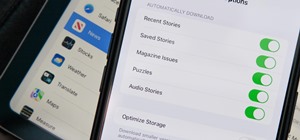
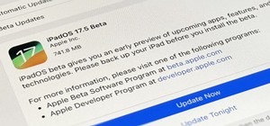
With iOS 17 on your iPhone, you have access to new health- and fitness-related features that can help you improve your mental well-being, reach your fitness goals, take your medication on time, avoid eye strain, and more. The biggest new features are found within the Health a ...more
With iOS 12, Apple is making up for mistakes from the past, with iPhone batteries being no exception. The new update builds upon both battery health and performance throttling tools introduced in iOS 11.3 by offering users more information about your iPhone's battery usage tha ...more
Unlike Apple Maps, Google Maps can tell you when a restaurant, bar, club, or other business you're thinking of visiting is busy. It's extremely helpful if you want to avoid peak times or wait for the place to be empty. If you can't pry yourself away from using Apple Maps, ther ...more
Amazingly enough, some of us still have to worry about exceeding our monthly mobile data limits. You'd figure carriers would have given the customers what they want by now by offering truly unlimited plans, but with two conglomerates sitting atop the U.S. cellular market with ...more
The desktop browser market has some stiff competition going on, but Opera has always been able to maintain its market share by offering innovative features such as a data saver option. With over 350 million users, it's safe to say folks are appreciative of the efforts being ma ...more
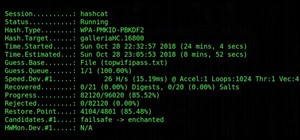
The easiest way around a security policy is to find users who don't follow it. The Have I Been Pwned database identifies accounts with information breached by major third parties like Yahoo and LinkedIn. With Maltego, hackers can locate breached accounts created using company ...more
Your iPhone tracks how many steps you take, how far you walk, and how many stairs you climb each day. That may seem a bit frightening, but it's all for a good reason: the Health app stores this data so you can view your progress in one place. But interestingly, opening the Hea ...more
It's certain that the release of Apple's ARKit is going to be game changing for businesses. This demo video was created by YouTube user hdsenevi who used the ARKit to create a simple bar chart. The chart has adjustable settings, allowing the user to make each bar larger or sm ...more
Android's stock battery menu is pretty decent. You can see which apps have been using the most power, and you can tell when your CPU was awake or asleep, among other things. But a lot of times, battery-sucking services will get lumped under the generic "Android System" header, ...more
With the advent of text messaging, our communication habits have changed drastically. Social niceties are still there, but we budget our words a little more since they have to be typed out rather than spoken. After all, SMS stands for "Short Message Service," so this is the na ...more
So much information exists online that it's easy to get lost in data while researching. Understanding the bigger picture can take a lot of time and energy, but narrowing the question to one that's easy to answer is the first step of any investigation. That's why analysts use o ...more
Russian cyber disinformation campaigns have many missions, but one of particular interest is using technology to monitor, influence, and disrupt online communications surrounding culturally sensitive topics or protests. The ability to watch these events, and even filter positi ...more
There are a number of options and hidden menus within Android that provide users more control over their device. With this control, you can better manage how your phone operates. We came up with a list of tips and shortcuts that, when used, will slowly put you on a path to bec ...more
Although the Health app mostly focuses on fitness, Apple has slowly added features to help with other aspects of well-being, including hearing. In iOS 13, there's now a headphones volume tracker in Health that monitors audio levels and lets you know when your music, podcast, m ...more
Task Manager got revamped quite a bit in modern versions of Windows. First introduced in Windows NT 4.0, it's become pretty popular among more advanced users. In Windows 10, Task Manager is not just a task manager anymore, it's also a system monitor, startup manager, history v ...more
The majority of Android devices have built-in sensors underneath the hood that measure motion, position, and several environmental parameters that provide data needed to monitor your movements and adjust accordingly. When the Samsung Galaxy S4 came out, they included for the ...more
Checking the weather ranks among the most mundane but essential tasks you can do on your smartphone. Thankfully, both the iOS App Store and Google Play are loaded with weather apps that add some much needed spice to this daily routine, giving you less of a reason to be caught ...more
Hackers rely on good data to be able to pull off an attack, and reconnaissance is the stage of the hack in which they must learn as much as they can to devise a plan of action. Technical details are a critical component of this picture, and with OSINT tools like Maltego, a sin ...more
There's a tool on your iPhone that can help you with your overall emotional well-being, one that can help you be more aware of your emotions throughout the day and build resilience against the stressors in your life. This State of Mind feature is found in the Health app and i ...more
While keeping your iPhone out of the bedroom might help to avoid unnecessary distractions before bedtime, it could be better served right by your side to help diagnose sleeping issues you may be experiencing each night. With the Apple Health app, and all of the apps and devic ...more
When trying to get fit, something that can easily be overlooked is your overall sleep quality. Your body needs sleep to recharge and it helps to maintain a healthy lifestyle, there's no denying it. Luckily, Google Fit can help you track your sleeping habits without having to j ...more
Whatever industry you're in, there's a decent chance you've had to work with Excel — that number-crunching powerhouse that drives the accounting departments of countless corporations across the globe. But chances are you've only scratched the surface of what this incredibly p ...more