New to Microsoft Excel? Looking for a tip? How about a tip so mind-blowingly useful as to qualify as a magic trick? You're in luck. In this MS Excel tutorial from ExcelIsFun, the 304th installment in their series of digital spreadsheet magic tricks, you'll learn how to add a s ...more
If you have a modern iPhone, you have an excellent video recorder at your disposal. Every iPhone since the 6S has the ability to shoot in 4K resolution, and each new iteration has brought new capabilities to the table. But even the best mobile shooter can use a little extra he ...more
New to Microsoft Excel? Looking for a tip? How about a tip so mind-blowingly useful as to qualify as a magic trick? You're in luck. In this MS Excel tutorial from ExcelIsFun, the 638th installment in their series of digital spreadsheet magic tricks, you'll learn how to add two ...more
Whether you're interested in learning Microsoft Excel from the bottom up or just looking to pick up a few tips and tricks, you've come to the right place. In this tutorial from everyone's favorite digital spreadsheet guru, ExcelIsFun, the 31st installment in his "Highline Exce ...more
In this Software video tutorial you will learn how to make a basic bar graph in Microsoft Excel. You will also learn how to give your chart a title and how to label the axes. First you put in all your data in to an Excel spreadsheet. Then you highlight the data you want to put ...more
In the last decade, the number of people working remotely in the US has increased dramatically, and so has their need for technology and software to supplement that remote work. Whether you work from home or a coworking office space, the requirement for highly compatible and h ...more
In the case of Apple Watch v. Fitbit, the winner comes down to the judge at hand. Apple currently offers two smartwatches — the Series 5 and the Series 3 — while Fitbit offers three models — the Fitbit Versa 2, Fitbit Ionic, and Fitbit Versa Lite. Whatever your assumptions abo ...more
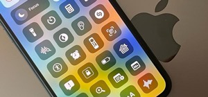
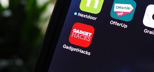
SharePlay is arguably one of the most significant features to hit FaceTime since group calls, and it's still hard to find apps that support shared experiences in FaceTime. Apple does list a few apps, but there is no official index of all the apps with SharePlay integration. Th ...more
Smartphones are inherently bad for privacy. You've basically got a tracking device in your pocket, pinging off cell towers and locking onto GPS satellites. All the while, tracking cookies, advertising IDs, and usage stats follow you around the internet. So no, there's no such ...more
Twitter's official iOS app is adequate if you're not much of a tweeter, but if you are, there's a lot of useful features that are missing. Luckily, there are plenty of free Twitter clients available that you can use on your iPhone. These third-party apps have features such as ...more
These days, it's easy to cut the cord. Thanks to a new crop of streaming TV apps, you can get the same service offered by a traditional cable subscription at a fraction of the price. After some extensive testing, we believe we've found the absolute best apps for cord cutting. ...more
An invaluable button on your iPhone can do hundreds, even thousands, of amazing things, but most iPhone users don't even know it exists. You can't push it. You can't click it. You can't press it. But it's the largest button on your iPhone, more powerful than the versatile Side ...more
When it comes to sniffing Wi-Fi, Wireshark is cross-platform and capable of capturing vast amounts of data. Making sense of that data is another task entirely. That's where Jupyter Notebook comes in. It can help analyze Wi-Fi packets and determine which networks a particular p ...more
Whether you've celebrated multiple cake days or you're just now getting your feet wet with Reddit, it's a rite of passage to choose your preferred smartphone client. Quick spoiler: Your best option most certainly is not the official Reddit app. Reddit's mobile site is pretty ...more
With the list of available mobile apps for moviegoers constantly expanding and improving, seeing a film at your local theater has never been better. With the right apps for your iPhone or Android phone, you can research movies, find out if showings are sold out, reserve seats, ...more
Trying to figure out which music streaming service to subscribe to can be a difficult task when the playing field is so crowded. Each has its benefits, as well as downsides, so finding the right one for your needs and wants can take a lot of overwhelming research. But we've do ...more
While keeping your iPhone out of the bedroom might help to avoid unnecessary distractions before bedtime, it could be better served right by your side to help diagnose sleeping issues you may be experiencing each night. With the Apple Health app, and all of the apps and devic ...more
Streaming movies and TV shows on phones is more popular today than ever, but what about when you're on a plane, have a limited data plan, or will be in a no-service area? You'll want to download your movies and TV shows instead. While Netflix is excellent, you can't rent or do ...more
Create a 2-axis chart in Excel 2007 combining a column chart and line chart
This video demonstrates how to add a data table to an Excel 2007 chart. From the people who brought you the Dummies instructional book series, brings you the same non-intimidating guides in video form. Watch this video tutorial to learn how to add a data table to an Excel 2007 ...more
New to Microsoft Excel? Looking for a tip? How about a tip so mind-blowingly useful as to qualify as a magic trick? You're in luck. In this MS Excel tutorial from ExcelIsFun, the 92nd installment in their series of digital spreadsheet magic tricks, you'll learn how to add data ...more
New to Microsoft Excel? Looking for a tip? How about a tip so mind-blowingly useful as to qualify as a magic trick? You're in luck. In this MS Excel tutorial from ExcelIsFun, the 204th installment in their series of digital spreadsheet magic tricks, you'll learn how to add a m ...more
New to Microsoft Excel? Looking for a tip? How about a tip so mind-blowingly useful as to qualify as a magic trick? You're in luck. In this MS Excel tutorial from ExcelIsFun, the 284th installment in their series of digital spreadsheet magic tricks, you'll learn how to create ...more
Adding a visual indicator to an Excel Gantt chart of how far into the project you are.
Love Microsoft Excel? This clip contains a tip that just might induce you to. With this free video tutorial from ExcelIsFun, the 81st installment of his "YouTubers Love Excel" or YTLE series of free video MS Excel lessons, you'll learn how to add conditional formatting to a ch ...more
If you use Microsoft Excel on a regular basis, odds are you work with numbers. Put those numbers to work. Statistical analysis allows you to find patterns, trends and probabilities within your data. In this MS Excel tutorial from everyone's favorite Excel guru, YouTube's Excel ...more
Whether you're interested in learning Microsoft Excel from the bottom up or just looking to pick up a few tips and tricks, you've come to the right place. In this tutorial from everyone's favorite digital spreadsheet guru, ExcelIsFun, the nth installment in his "Highline Excel ...more
New to Microsoft Excel? Looking for a tip? How about a tip so mind-blowingly useful as to qualify as a magic trick? You're in luck. In this MS Excel tutorial from ExcelIsFun, the 576th installment in their series of digital spreadsheet magic tricks, you'll learn how to add a p ...more
This video is about formatting the charts in Excel especially the x and y axes. The video begins by selecting a chart and right clicking the dates at the bottom of the data points. The format axis window pops up and by making changes to the style, color and the weight of lines ...more
This video is from HelpVids and describes how to change the axis titles on charts in Microsoft Word 2007. To access the chart tools, select the chart and the tools will appear above the ribbon. There are many different design options that you can preview on the screen to make ...more
Take a look at this instructional video and learn how to use a Microsoft Office Excel worksheet that contains employee data to create shapes, connect them according to your organization's structure, and add data to each shape in your drawing automatically.
Creating a digital spreadsheet by hand can certainly be tedious, especially if you're copying a printed paper table word for word, number for number. Instead of typing information that's already there, however, use Microsoft Excel on Android or iOS to snap a photo of that prin ...more
In this video tutorial, you'll learn how to create a $30 steadicam for your Apple iPhone 4. The rig consists of a three-axis gimbal with a weight at the bottom. You'll require the following materials: A 2" PVC outer ring. A 1" PVC coupling ring. A 3/4" PVC pipe. A skateboard ...more
Here are some charts I made to help you master crafting recipe levels. Don't forget to note the rewards at the bottom of each chart! If you need an overview of what Crafting Mastery is, check out the official Farmville blog post here. I have taken the information from their c ...more
If you want to create a Pareto Chart for categorical data in MS Excel you should first have your data input into Excel already. From your data, you should highlight the cells that you want to count the frequency for and in the frequency box you should type in =COUNTIF and high ...more
To sort data in Excel spreadsheets, have each category (for example, first and last names) in a single column. Click on any cell in the column you wish to sort. Be careful not to highlight the entire column, or results will be sorted only in that column. Click on DATA on the r ...more
In this Software video tutorial you will learn how to use the filter & sort feature in Excel. First create a column chart on an excel sheet. In this example, it is a date and sales chart. Click alt+F1 and the chart is displayed. Then click and delete the legend and the horizon ...more
In excel a left click is made on box A1 and the X title is typed in as year. In A2 the year 2001 is typed and in A3 the year 2002. Both A2 and 3 boxes are highlighted and the bottom right hand corner is used to drag the work into a copied sequence down to A12. In B1 "populatio ...more
Sydus 93 teaches You Tubers how to read a binary clock by demonstrating the following process: A binary clock is made up of four rows and six columns of colored or uncolored dots. The rows, from bottom to top, represent the numbers one, two, four and eight. From left to right, ...more
A histogram is a summary graph showing a count of data points that fall in various ranges. Histograms are used in statistics and other forms of mathematics. In this video, learn how to create your own histogram using data analysis on the computer. This tutorial will show you h ...more
Apple just released its biggest update to iOS 17 yet, and there are 60 exciting new changes for your iPhone. With iOS 17.2, you get a brand new app, more Apple Music enhancements, upgrades in Messages, and a new security feature that was announced last year, as well as changes ...more
Last year, your iPhone's Weather app received some great features, but things are even better now with the latest iOS 17 version. Apple's Weather app has been around since the very beginning. In 2007, it provided little information, mainly consisting of the seven-day forecast ...more
Apple's latest big software update includes an entirely new Apple app, a controversial change in the TV app, better Siri control, an improved Shortcuts app, interesting Safari upgrades, Apple Music Sing, and more. Keep reading to see what iOS 16.2 has to offer your iPhone. Th ...more
There aren't many iPhone apps that let you change their color theme beyond light and dark appearances. They really don't need to either because iOS has a few hidden tricks up its sleeves to help you customize any app's colors either during a specific session or every time you ...more
Your iPhone's Weather app received its biggest update yet. Apple finally incorporated its Dark Sky purchase into Apple Weather, so you'll see more information for each location's forecast. Plus, there are a few surprises to be excited about, such as the ability to add more tra ...more
Whenever you need to type out a fraction on your iPhone, whether in a message, word document, presentation, math problem, recipe, or wherever else you need it, it's easy to use numbers and slashes. But there's a way to make fractions look more professional and easier to read s ...more
Rumors about the 2022 iPhone series stirred well before the iPhone 13 models were even released. While Apple remains quiet on the next big iPhone, as it always does, we're seeing more and more leaks and reveals for the iPhone 14 series as we lead up to a likely fall release. ...more
When you look at your status bar on your iPhone, you'll almost always see the battery icon, which gives you an estimate of how much battery life you have left before you need to charge the device. What you won't always see is the exact battery percentage, but there are multipl ...more
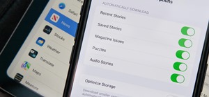
With the holidays right around the corner, it's easy to miss a big software update on your iPhone, and by that, I mean iOS 15.2, which was pushed out Monday, Dec. 13. There's a surprising amount of new features and changes in the updated firmware, and there are a few big ones ...more
The iPhone doesn't stop at last year's excellent iPhone 12 lineup. Apple's been developing its iPhone 13 models for a while now, and there are a lot of rumors already with eight or nine months still to go until a release. This year, we're expecting four new models with similar ...more
Whether you have or are getting an iPhone 12, 12 mini, 12 Pro, or 12 Pro Max, the default way to check the current battery life is via the tiny battery icon in the top right of the status bar. But that does not accurately depict how much juice is left, not as a specific percen ...more
If you're getting or already have a new iPhone 12 or 12 Pro, its big-ticket feature is MagSafe, something you'll definitely want to explore. While the technology is new to iPhone, Apple used the MagSafe name for its magnetic charging connectors on older MacBook models until US ...more
The new iOS 14 for iPhone arrived Wednesday, Sept. 15, 2020, alongside iPadOS 14, and there are a lot of features to uncover. Improved widgets. Better home screen customization. Exciting Messages improvements. New abilities in Camera and Photos. There's so much here that it'll ...more
Samsung's One UI has slowly become the model for Android skins. The old iOS-like TouchWiz already feels like a relic, thanks in part to the newer user interface's exceptional design and fast but meaningful updates. One UI is so good, other OEM skins have copied elements of it. ...more
Using a strong password is critical to the security of your online accounts. However, according to Dashlane, US users hold an average of 130 different accounts. Memorizing strong passwords for that many accounts is impractical. Fortunately, password managers solve the problem. ...more
Although the Health app mostly focuses on fitness, Apple has slowly added features to help with other aspects of well-being, including hearing. In iOS 13, there's now a headphones volume tracker in Health that monitors audio levels and lets you know when your music, podcast, m ...more
Who here binges TV on a regular basis? I know I do. Never before have we had so many options for watching our favorite shows, especially when you consider how easy it is to stream from anywhere on a mobile device. But sometimes, all that choice gets a little overwhelming. What ...more
According to a study done by Kaspersky, 7.6% of Android users root their phones. That may not sound like a lot, but with over 2 billion Android devices out there, the math works out to over 150 million rooted phones — more than the total population of Russia, Mexico, or Japan ...more
You're a busy, on-the-go professional, so you deserve an email client that keeps up with you. "Mail" on iPhone wasn't always the best option, but thanks to iOS 13, it feels like a completely different app. That said, there are plenty of alternatives that offer a different expe ...more
For many of us, our work phone and our personal phone are one and the same. Just any old phone isn't going to cut it when you need to meet a deadline — a phone with built-in features that make it easier to get things done is almost a must. For this article, we defined product ...more